This is a project I've been working on this semester in my Visual Communications class at Weber State University. Shear Pleasure Salon and Day Spa is a business located in Tooele, Utah. It has been maintained for the past 23 years by a woman who has a deep love for people. She loves to help those she meets see their true beauty not only from the outside but also from within. Being there for people has always been her main focus—not revenue.

This is the logo I created for Shear Pleasure. My main goal was to bring style, elegance, and innovation but still have the family values and people oriented atmosphere that is found in this business. To have the logo show class and elegance, I decided on a backgound of an easy tan color. Then I created most of the elements and designs be the always classy black. Both of these elements helped me achieve the classy/elegant look I was going for. However, I also wanted to show "cute and flirty" so I added bright pink to the words of the logo to really help them stand out. Also to bring cute and flirty I picked a font called Riesling. This font caused an important element of my design--the swoopy S that the scissors are about to cut. I wanted one of the letters to swoop down (in a way that would resemble hair) so that I could include scissors that were to cut it. My favorite part about this element is the tension it brings. They're close to making contact, but they're just not quite there. I aligned Salon and Day Spa to be centered between the first S and the swoopy S. I wanted it close to the name, but not quite touching.

This is the front of the business card I created. The main element on it is the logo, so that it's clear what business the card is for. I made it the main element by placing it top center and by also making it the biggest part of the card. The pink coloring also helps it stand out. The next element I wanted to stand out is the name of the owner/stylist. I want the customers to know who their hairdresser is and who they need to get in contact with. I placed it right under the logo so that as they read down the card it would be the next thing they see after the logo. I didn't want it centered with the logo, however. Bringing it closer to the left made the information seem more interesting and helped it stand out more.The only other information about this business needed was the address and phone number. I only put that information on the card because all appointments are made over the phone or in person. The QR code placed next to the information is a link to her contact information as well as the business Facebook page. In order to keep the eye from running off the card I placed black stripes at the top and the bottom. I feel that these stripes help keep the eyes on the important information in the middle.
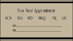
This is the back of the business card we just saw above. The business cards for this salon are given to customers for appointments so that the customer knows where to go, who to go to, and also how to get in contact with them in case they need to cancel or reschedule. All this information is given on the front of the business card, seen above. Now for the back of the card, my idea was to have a reminder where the date and time of the next appointment could be written. That way customers will always know when their appointment is, where it is, who it's with, and how to get in contact with them--all from the front and back of the business card. It is the perfect business card for a salon and day spa.

This is the envelope I created for Shear Pleasure. I aimed for simplicity and only put the logo in the upper left hand corner. There's no use wasting ink on an envelope they will throw away. The goal of this envelope is to simply to let them know who the letter is from. The logo used is consistant with the logos on all the other items I've created. The only other thing on this envelope is the store address. There's plenty of room for the stamp and the information for who it is going to.

The letter head I created for Shear Pleasure is very much like the logo except it's stretched across the entire width of the page. Repetition is something I strived for throughout this project. I wanted to make sure that every design I created was consistent so that consumers would always understand that the designs were for the same business. I brought the logo off to the left instead of centering it with the page. It gives the letter head a classy and easy look to have it aligned left. Then I kept the address and phone number closer to the logo for good proximity. I felt like creating a water mark for the background was unnecessary and distracting. The letter only needs the logo, and the returning information so that if the receiver of the letter needs to contact the business. Like the other designs, this letter head is bordered by black stripes to keep the eyes on the information inside.

This is what the letter looks like when filled with words. The words really fit nicely in the space left. The letter head doesn't take away from or cover the message. It looks clean and easy to read. An overall, classy letter.
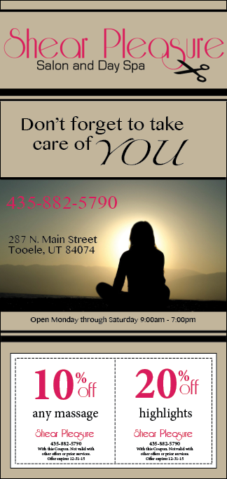
This is the ad I created in color. It can be used in a magazine or even for simple handouts. In most ads created for a salon there is usually a very beautiful, yet serious woman with gorgeous, flowy hair. Something like this would not have worked for this business. Like I mentioned above, this salon is very family oriented. Having a seductive girl on the ad would not have been what they wanted to show. They focus on inner beauty just as much as they do on the physical appearance. That is why my ad is focused on the saying 'Don't forget to take care of you.' The main element that stands out the most in this ad is the beautiful picture that represents this saying. The contrast of the colors against the classy tan and black ad immediately draw the eye to the beauty of the picture. I chose this picture because it shows a girl who seems to be confident, both inside and out. The next big part of this ad is the logo. The repetition factor of using the same logo on every design guarantees that the viewer will connect this ad with who it belongs to. Located on the pictures is the phone number in a large, bright font. I wanted this information to stand out since it's the best way to make an appointment. The address is the placed within close proximity of the phone number. The other bit of information placed on this ad is the store hours, which is something many people like to know when they see an ad. The last part of this design is the two coupons located at the bottom for easy access. I made the 10% off and 20% off large and pink so that the eye was immediately drawn to the discount. Information about the business and the coupon is also placed on the coupon so that when it's cut from the ad, customers can still know what it's from and how to use it.
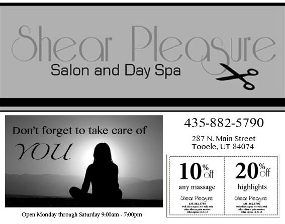
This ad is similar to the one above except it's formated to go in a newspaper. I've taken all of the elements from above and have made them black and white. The logo is very large in this ad to show who the ad belongs to. The next big element is the picture. However, it doesn't quite stand out as much as it did in the first ad because of the lack of color. Because of this I decided to place the saying 'Don't forget to take care of you' right on the picture. It gives meaning to the picture and helps it stand out more. Again, for repetition I put the same information (the number, address, and hours) in the same font and size as the color ad. The last part of this design is the coupons which again are in a place of easy access.
